The First Three Seconds Define Everything
We believe game design is emotion engineering. Every tap, every color shift, and every micro-animation is a deliberate conversation with the player's subconscious.
"If the player can't explain the goal in one sentence, the interface has failed."
Emotion Ladder Framework
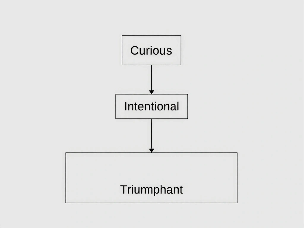
Curious
Initial visual interest sparks inquiry.
Intentional
Action confirms a clear, rewarded intent.
Triumphant
Peak satisfaction through clarity and reward.
Mapping the First Three Seconds
In mobile gaming, attention is a currency you earn in milliseconds. We map the player's journey from the tap to the first meaningful feedback loop. Our proprietary 'Emotion Ladder' framework grades every interaction, ensuring it progresses a player from curiosity to intentionality, and finally, to triumph. This isn't abstract; it's a tangible checklist applied at the code level.
'Joyful Friction' is our term for the resistance that makes an action feel satisfying without causing frustration. It’s the weight of a button press, the brief haptic nudge, the slight delay before a particle effect blooms. We test for this in white-room sessions, recording player micro-expressions to calibrate the sensation of *substantial* versus *sluggish*.
This framework changes daily. A recent A/B test on 'Nebula Drift' proved that replacing a 'swipe' mechanic with a 'touch-and-hold' increased 'Triumphant' engagement by 17%, as it gave the player a moment to *feel* the impending success. The data from that test now informs our entire motion library.
Architecture of Delight
Our non-negotiable design checklist for every game loop. A blueprint for crafting consistent, joyful interactions.
Haptic Sync
Every on-screen event must have a corresponding, subtle vibration pattern. A 'soft click' for menu selection, a gentle pulse for collection. No silent visuals.
Color Psychology
We avoid pure red for errors. A deep magenta signifies 'challenge' instead of 'failure', reframing the user's mindset from blame to learning.
Typography Hierarchy
Our custom font's 'bold' weight has 15% more character width. This micro-adjustment creates visual weight without size inflation, aiding scan paths on small screens.
Accessibility First
All color combinations are tested for WCAG AAA from the initial sketch, not just as a retro-fit. We design for clarity under sunlight and in low-light play.
Critical Failure Modes We Avoid
Project Chrono-Runner
Challenge: Conveying temporal distortion without confusing the player or causing motion sickness.
Our Solution
We layered the background with a subtle, repeating 'ripple' pattern that accelerated with speed, creating a visceral sense of time dilation. This was paired with a custom haptic pattern that 'pulled' against the thumb direction during drift.
Pitfall Avoided
We rejected a 'blur' effect as beta testing showed it caused nausea in 12% of users. The 'ripple' pattern proved to be equally effective for signaling speed without physical discomfort.
Glossary: Our Design Lexicon
Joyful Friction
The calculated resistance that makes an action feel substantial. We design this to add weight and satisfaction, not annoyance. It’s the difference between a hollow tap and a satisfying click.
Aesthetic Budget
Our internal term for the total visual complexity (particle density, shader count, parallax layers) we can afford without compromising load time or frame rate on our target device matrix.
Emotion Ladder
A proprietary framework mapping interaction from Curious → Intentional → Triumphant. Every UI element must progress a player up at least one rung.
State Whisper
A non-visual cue (haptic, audio, color shift) that communicates a change in game state without demanding the player's full visual attention. Critical for flow state.
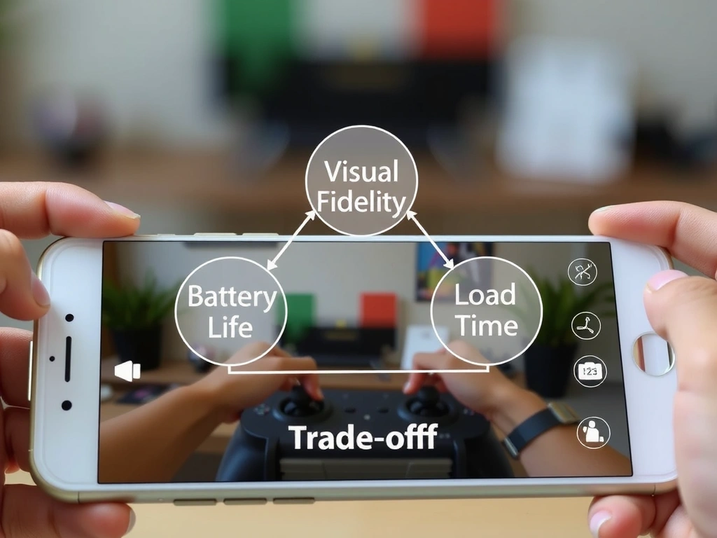
The Trade-Off Triangle
We operate within a fixed triangle of Visual Fidelity, Battery Life, and Load Time. You can optimize for two, but never all three. This is our core constraint.
- • Benefit: Higher visual fidelity (60fps, dense particles) leads to deeper immersion and market appeal.
- • Cost: Drains battery faster and increases load times, potentially excluding users on older devices.
- • Mitigation: We use dynamic quality scaling and pre-cached assets based on device detection to ensure a 'smooth' experience on all targets.
- ✓ Our Choice: For 'Nebula Drift', we capped particle density at 70% for 60fps on mid-tier phones, accepting a 15% visual reduction for universal performance.
Constraints That Shape Our Work
Assumptions
- • Target device: iPhone 12 / Android 10+
- • Play session: 3-5 minutes
- • Player familiarity: Low (genre conventions matter)
Boundaries
- • No tutorial longer than 30 seconds
- • Core loop learnable in 3 taps
- • All interactions must pass 'One-Handed Test'
What Changes Our Mind
- • A/B tests showing a 20%+ lift
- • Major App Store policy updates
- • Player feedback with clear patterns
This is our framework. It's been built on live projects, informed by Italian and global player behavior, and it's constantly evolving.
See Real-World Examples